
- After logging into the site, you will be directed to the dashboard page.
- Navigate to the “Divi” on left side.
- Click on the “Theme Customizer”.
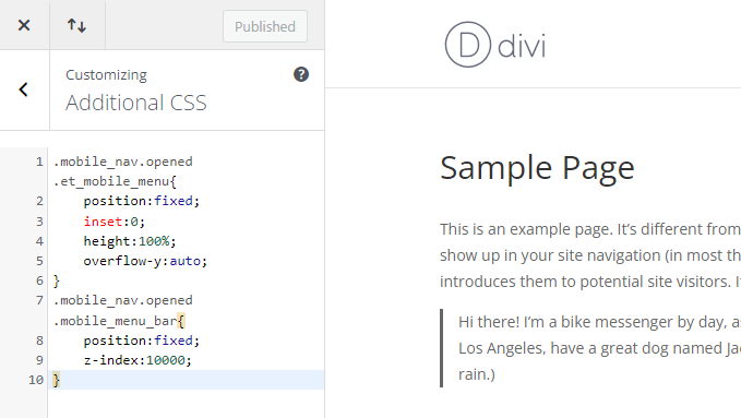
- Go to “Additional CSS”, and add the custom snippet,
.mobile_nav.opened .et_mobile_menu{
position:fixed;
inset:0;
height:100%;
overflow-y:auto;
}
.mobile_nav.opened .mobile_menu_bar{
position:fixed;
z-index:10000;
}- Click the “Publish” button.
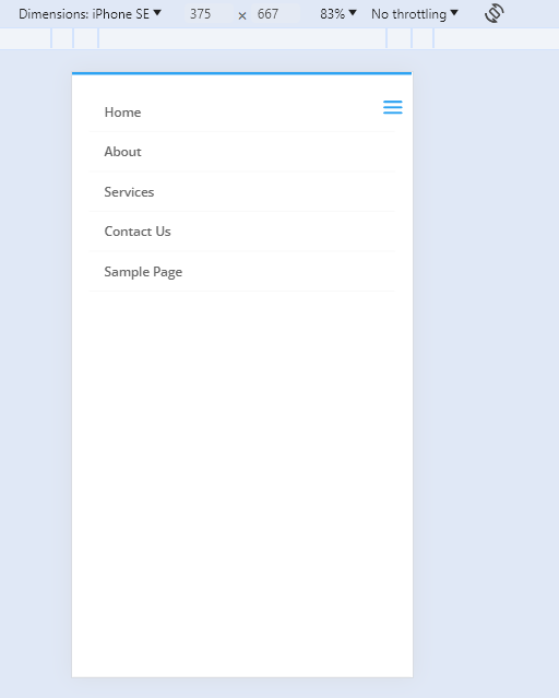
- To view the site, click on “Visit Site”.
- You can now see your mobile header full width.
- This is how the mobile full-width menu will look like.
This is how you are making mobile header full width in Divi theme.
Visited 1 times, 1 visit(s) today